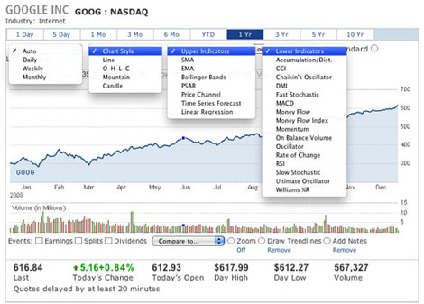
This is the acronym for “moving average convergence/divergence.” Got it? OK, here’s the simple explanation. This graph shows the difference between a fast- or slow-moving average of a stock’s prices. It is designed to identify significant trend changes. This can be a very important tool for you to anticipate trend movements that may occur in the near future. Even as a modest investor, you may be able to generate knowledge that the mega investors spend many dollars and hours to achieve. Analyzing these graphs can give you the same ability to intelligently project what track a security may follow. When using the charts on your virtual account, note all of the different indicators you can use (see the chart below)