The new wave of portfolio management is here!
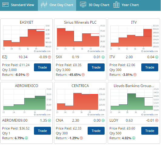
With our most recent update, all StockTrak users can view their Open Positions either with the classic list view, or switch to brand-new Charts.
The charts can toggle between the performance of each user’s holdings over the last day, month, or year. They are also color-coded: green means the user is making money on that holding, red means they are losing money.
This is a great new way for students to visualize their portfolio, and our beta testing group has given it rave reviews! Try it out now!
 Home Budget Calculator
 10-04 Practice, Practice, Practice